Heyyyyy. I'm currently working on my portfolio and my earphones are breaking yay. Also watching Big Bang Theory! Sheldon is so awesome. But otherwise, I've been taking life drawing at community college and drawing random people at Barnes & Noble and Princeton and animals at the zoo. And then random people come up to me and stare at my drawings. Or worst, they walk by but they're uncomfortably close as they move their head so their eyes are constantly on my sketchbook. Did that make sense? kfajoiwpejr. Or sometimes they talk to me. Argh social situations.
Anyway, just a quick post on composition. I had an awesome art foundation teacher freshmen year. She taught me about 60% of what I know. Here are her rules on composition.
1) focal point - have one focal point, be most interesting, either high contrast or complexity, should be off center
2) diagonal lines - create a sense of visual movement, can have implied or real diagonals
3) sides - draw things that come off at least 3 sides of the paper, draw information all the way to the edges, engage all the space, draw large
4) corners - all the corners need to be different and interesting, only one corner should be empty, need moments of silence to process, at last 3 need to be filled
This simplifies things, right? Basically, you want to fill up the page, have lots of diagonal things and one super interesting focal point. It should be the star of the show. Also, don't make it too crazy. Only the focal point should be really complex. Everything else should kind of lead into it.
I think this is it. Gahh... this was really short. I'll make the next one longer. But right now, I have to make a powerpoint about Charles LeBrun. Look him up. It's really cool.
Artists are Probably Crazy
Popular Posts
-
Hey! I finished my online drawing animals class. It's actually called drawing furries. Furries are characters that are a blend of humans...
-
I think I'll start off with the distraction. I finished!!! This painting I was working on forever. Here's a very bad cell phone ...
-
Hey everyone. I've been having a lazy Saturday so I think I'm going to talk about gestures. These are gesture drawings. They hav...
-
Hey y'all! How's your week been? Me, I finished AP's! Yayyyy! Well, AP. Since I only took one. But I'm done now! Yayyyyyy! ...
-
Hey! My name's Sandra and I'm doing this thing. I'm at this really tiny library right now. It's so small that there are only...
-
Hey! Happy mother's day! Today I got up super early to make my mom breakfast. My brother came down and helped. Then, he got all upset b...
-
Hey all! Guess what! I just came back from prom! It was pretty fun. And now I'm so tired. So onto other things. If you did a whole l...
-
Hey everyone! So lately, I've been puzzled over this one question: what makes a good character a good character? There's all these s...
-
Hey, I figured I would show you some cool stuff today. So, you know how you keep hearing how animation makes drawing all "alive" a...
-
Hey! So I just finished up a tournament. I am exhausted. My legs are so tired that they hurt. And I've sat down in this one spot. I ha...
Wednesday, July 30, 2014
Saturday, May 31, 2014
A Brief Thing on Color
Some stuff about color! Just the basics because I'm not an expert.
So the color wheel. Remember it.

So you got the warms on the right with red, orange and yellow. Then, the cools on the left with green, blue and violet. Wait, that red-violet does not look like red-violet. It needs way more red.

Ok, let's do this weird one with the shapes. But now there are no names. klsdfj;iojweiorj
Anyway.
So the primary colors: red, blue yellow.
Then, you mix the primaries to make the secondary colors: red and yellow make orange, yellow and blue make green, red and blue make purple.
After that, you mix a primary and a secondary to make a tertiary. Oh yeah, they should be next to each other.
Pretty straight forward right? Good. Now what colors go well together?
Well, you already know two color schemes.
Primary

Secondary

OK, cool. So now you got the color. Or hue.
Once you add white to a hue, you get a tint.
Once you add black to a hue, you get a shade.
When you add gray, you get a tone.

Ok....random spaces, cool.
Value is how light or dark a color is.
This a value scale.

So a really helpful trick is to take a picture of your work and turn it to black and white on the computer. Then, you can see if you have enough different values. Nothing really stands out if everything is the same value. Also, you can see where the lights and shadows are. What I like to do is mess with the brightness and contrast so the difference really stands out.
Next, a hue is pure color. It is anything on the color wheel. You can also make tones by adding complementary colors. Complementary colors are colors across from each other on the color wheel. So red and green, blue green and red orange, yellow and violet, yellow green and red violet, orange and blue, so on.
With all this stuff, you can make all the colors in the world!
So now you know another color scheme: complementary

The key to complementary is to have a dominate color and an accent color. Or else, the complementary colors will fight with each other and hurt your eyes.
So next is with the tints and shades. Monochromatic! Just one color with its everything

Next, you got the analogous color scheme where you pick about 3 colors next to each other.

I have no idea why this keeps doing the random space thing.
Then you got split complementary where you got the complementary colors but instead for one of the colors, you use the two colors next to it. So like yellow, red violet and blue violet.

Yeahh! So many colors! I think that's it for today. Seeya!
So the color wheel. Remember it.
So you got the warms on the right with red, orange and yellow. Then, the cools on the left with green, blue and violet. Wait, that red-violet does not look like red-violet. It needs way more red.
Ok, let's do this weird one with the shapes. But now there are no names. klsdfj;iojweiorj
Anyway.
So the primary colors: red, blue yellow.
Then, you mix the primaries to make the secondary colors: red and yellow make orange, yellow and blue make green, red and blue make purple.
After that, you mix a primary and a secondary to make a tertiary. Oh yeah, they should be next to each other.
Pretty straight forward right? Good. Now what colors go well together?
Well, you already know two color schemes.
Primary
Secondary
OK, cool. So now you got the color. Or hue.
Once you add white to a hue, you get a tint.
Once you add black to a hue, you get a shade.
When you add gray, you get a tone.
Ok....random spaces, cool.
Value is how light or dark a color is.
This a value scale.
So a really helpful trick is to take a picture of your work and turn it to black and white on the computer. Then, you can see if you have enough different values. Nothing really stands out if everything is the same value. Also, you can see where the lights and shadows are. What I like to do is mess with the brightness and contrast so the difference really stands out.
Next, a hue is pure color. It is anything on the color wheel. You can also make tones by adding complementary colors. Complementary colors are colors across from each other on the color wheel. So red and green, blue green and red orange, yellow and violet, yellow green and red violet, orange and blue, so on.
With all this stuff, you can make all the colors in the world!
So now you know another color scheme: complementary
The key to complementary is to have a dominate color and an accent color. Or else, the complementary colors will fight with each other and hurt your eyes.
So next is with the tints and shades. Monochromatic! Just one color with its everything
Next, you got the analogous color scheme where you pick about 3 colors next to each other.
I have no idea why this keeps doing the random space thing.
Then you got split complementary where you got the complementary colors but instead for one of the colors, you use the two colors next to it. So like yellow, red violet and blue violet.
Yeahh! So many colors! I think that's it for today. Seeya!
Saturday, May 24, 2014
Funny Interesting Weird However You Want to Put it Videos!
Hey!
So I just finished up a tournament. I am exhausted. My legs are so tired that they hurt. And I've sat down in this one spot. I haven't gotten up. Ughhhh. And I'm going rock climbing tomorrow. I think I'm just going to be once huge mass of sore.
But anyway. I think today I'll show some stuff I did. Video stuff.
First animation! This was at SAIC Pre-College. I took a two week course in animation. Lots of fun. Chicago is just one of the most amazing cities ever. Wow.
This class was focused on 3D animation with Maya and Aftereffects. We also experimented with 2D and claymation. These two were made on Maya. I built the house with SketchUp. I then exported it into Maya and added all the animation. The effects in the first one are from Aftereffects.
The next summer, I went to RISD Pre-College for Animation. It was one of the best classes I took. I learned about the 12 principles of animation. I did some exercises like these.
The final week, I made a final project.
Pre-College is an awesome way to explore the medium and find out about an art school. You're pretty much a real student there so you can use all the facilities and materials they have. You also have the freedom to explore the town and new places. And you can also make a pretty good portfolio too. So definitely try to go to Pre-College somewhere!
Yup, and also community college classes are extremely valuable. Go to your community college! You can basically take college classes anytime! This is what I made in 3D Modeling in Maya at my community college.
I met a lot of interesting college people.
It's pretty late so I think I'll go to sleep.
See ya!
So I just finished up a tournament. I am exhausted. My legs are so tired that they hurt. And I've sat down in this one spot. I haven't gotten up. Ughhhh. And I'm going rock climbing tomorrow. I think I'm just going to be once huge mass of sore.
But anyway. I think today I'll show some stuff I did. Video stuff.
The next summer, I went to RISD Pre-College for Animation. It was one of the best classes I took. I learned about the 12 principles of animation. I did some exercises like these.
Yup, and also community college classes are extremely valuable. Go to your community college! You can basically take college classes anytime! This is what I made in 3D Modeling in Maya at my community college.
It's pretty late so I think I'll go to sleep.
See ya!
Saturday, May 17, 2014
Contour
Hey y'all!
How's your week been? Me, I finished AP's! Yayyyy! Well, AP. Since I only took one. But I'm done now! Yayyyyyy! Now I have free time! Except not really. Portfolio, man. Okay, enough of this.
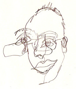
So I'm going to talk about this fun exercise. Blind contour drawing.
What is a contour?
Well, basically, it's an edge. Some people call it an outline. But, it's a little bit more than that. I learned it as what you see when a surface curves away from you.
So cool! Like the outline of your arm, it curves away from you, so it's a contour! Very cool.
So a contour drawing is when you just draw the contours of something. Whoa there.
So contour drawings look something like this.


Pretty neat, right?
So a blind contour drawing is when you draw without looking at your paper. A modified contour is when you can take peeks.
The important thing about blind contour drawing is that you connect your eye to the pencil. So as you slowly move your eye along the contour, your pencil is doing the same thing on the paper. But never look at the paper! So the end result's going to look pretty weird. But that's okay!
Here's a good video. Very informative, but I wish it was more exciting.

How's your week been? Me, I finished AP's! Yayyyy! Well, AP. Since I only took one. But I'm done now! Yayyyyyy! Now I have free time! Except not really. Portfolio, man. Okay, enough of this.
So I'm going to talk about this fun exercise. Blind contour drawing.
What is a contour?
Well, basically, it's an edge. Some people call it an outline. But, it's a little bit more than that. I learned it as what you see when a surface curves away from you.
So cool! Like the outline of your arm, it curves away from you, so it's a contour! Very cool.
So a contour drawing is when you just draw the contours of something. Whoa there.
So contour drawings look something like this.
Pretty neat, right?
So a blind contour drawing is when you draw without looking at your paper. A modified contour is when you can take peeks.
The important thing about blind contour drawing is that you connect your eye to the pencil. So as you slowly move your eye along the contour, your pencil is doing the same thing on the paper. But never look at the paper! So the end result's going to look pretty weird. But that's okay!
Here's a good video. Very informative, but I wish it was more exciting.
Yup, so some examples.

Everything is all over the place.
So try it out! Have fun! It's a good way to loosen up your mind and get rid of all expectations. Do it!
Seeyaaa!
Sunday, May 11, 2014
Sheldon Borenstein
Hey!
Happy mother's day! Today I got up super early to make my mom breakfast. My brother came down and helped. Then, he got all upset because I criticized his cooking. And he stormed dramatically up to his room. But seriously, he took like 10 minutes to fry an egg. He moved soooooo slowly. And afterwards, I told him I meant 2 eggs for each person. And he threw a fit. I'm sorry I don't expect 3 people to share 2 eggs.
But anyway, I hoped you enjoyed yours. The breakfast got done. But I am not enjoying this moody brother of mine. Please practice frying eggs.
I'm going to tell you about this awesome dude in California. His name's Sheldon Borenstein. And he used to work for Disney and he's an awesome animator. Now he has a school and he teaches people to draw.
He's pretty funny. So I don't live in California. I'm kind of pretty far from it too.Can't just go over there when I feel like it. Luckily, the internet exists. Video recorders exist.
Sheldon has a whole lot of videos about foreshortening, character design, landscapes. You have to buy them and it does cost some money. However, education is priceless and this is your chance to learn from a professional.
I've learned a lot from his life drawing videos. Of course, you can't see the models so you should also take life drawings classes. Here's the website.
http://www.sheldonsartacademy.com/
Check it out. It's awesome.
That's all for today! See you later!
Saturday, May 3, 2014
Think shapes!
Hey all!
Guess what!
I just came back from prom! It was pretty fun. And now I'm so tired.
So onto other things.
If you did a whole lot of gestures and found action lines in everyone, now is the time to start thinking in shapes. Yup, welcome back to geometry. Fun geometry though. You're only really thinking about cylinders and rectangles.
Ok, so let's think about the human body. We're pretty 3-D, right? I mean, it would be hard to do things if we weren't. So we're 3-D. That means we got planes, like side planes. Because we stick out. Oh, and a front plane and a back plane. Yup, a rectangle.

That's you.
If you put a human body in front of you, you can roughly encase it in a rectangle.
And if you think about it, you can roughly encase the arms and legs and head into rectangles too.
So why don't you just simplify everything into rectangles and cylinders?
(P.S. I know I keep saying rectangles when I mean rectangular prisms, but same difference.)
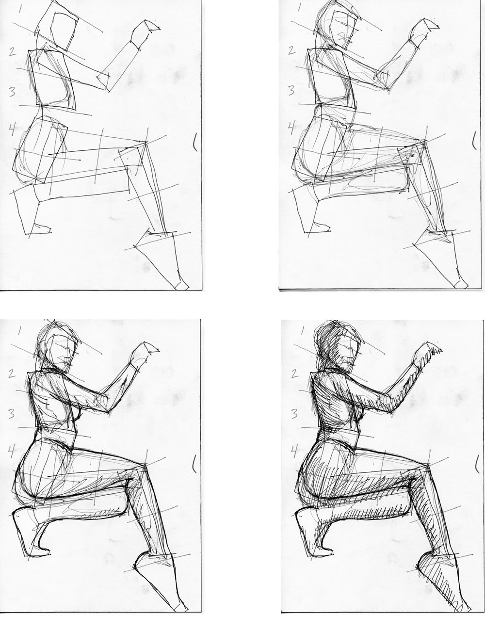
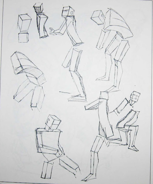
So the first one is done with actual 2-D rectangles. It simplifies the human figure to the basic components and makes it easier to draw the whole figure in proportion. But you notice that the figure doesn't really pop out until he puts in another plane with the shadows. Now look at the second one. By using 3-D shapes, you can really see how the body twists. They have mass.
 Yup, So practice this with gestures! Sorry this is such a short post! But keep drawing! Bye!
Guess what!
I just came back from prom! It was pretty fun. And now I'm so tired.
So onto other things.
If you did a whole lot of gestures and found action lines in everyone, now is the time to start thinking in shapes. Yup, welcome back to geometry. Fun geometry though. You're only really thinking about cylinders and rectangles.
Ok, so let's think about the human body. We're pretty 3-D, right? I mean, it would be hard to do things if we weren't. So we're 3-D. That means we got planes, like side planes. Because we stick out. Oh, and a front plane and a back plane. Yup, a rectangle.
That's you.
If you put a human body in front of you, you can roughly encase it in a rectangle.
And if you think about it, you can roughly encase the arms and legs and head into rectangles too.
So why don't you just simplify everything into rectangles and cylinders?
(P.S. I know I keep saying rectangles when I mean rectangular prisms, but same difference.)


So the first one is done with actual 2-D rectangles. It simplifies the human figure to the basic components and makes it easier to draw the whole figure in proportion. But you notice that the figure doesn't really pop out until he puts in another plane with the shadows. Now look at the second one. By using 3-D shapes, you can really see how the body twists. They have mass.
Sunday, March 30, 2014
Biggest Mystery Ever!
Hey everyone! So lately, I've been puzzled over this one question: what makes a good character a good character? There's all these successful movies, books and TV shows out there. And then there are some that aren't. So why do people relate to and love some characters but not others? Therefore, I'm going to come up with a few theories.
My first one was that a character had to have a tragic past.

His parents were killed by an evil wizard.
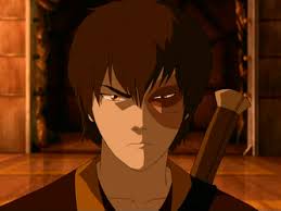
He was thrown out by his father.
I don't know about you, but I really like the Lone Ranger.

I don't want to spoil anything so I'm just going to say that Tonto had a really sad past.
Tonto got me thinking about guilt, because some characters had some tragic death or sin that they have to make up for.

He killed his brother.
But then what about the bad guy turning into the good guy?
I really love it when that happens.
I hope you guys all read Harry Potter.

Do we love heroes that make mistakes just like us?
They have so much power, but in the end, they're just as clumsy and dumb as normal human beings.

I know for a fact, that we love characters who change for the better by the end of the movie or whatever.
Do we like the underdog? Do we like it when the character overcomes an impossible challenge because it makes us feel like we can do it too?

Or do we just like people who are so freaking awesome and we just want to be them?


They always manage to get out of the worst situations with only their wit while maintaining a sense of humor along the way.
Man, I wish I was as cool as Jack Sparrow.
Omigod, my brain hurts. I don't get it! What's the secret?
Also, what makes some stories so good??


IS THERE A SECRET FORMULA???????
I DON'T KNOW.
SIGH
OK, THAT'S IT FOR TODAY.
BYE!
My first one was that a character had to have a tragic past.
His parents were killed by an evil wizard.
He was thrown out by his father.
I don't know about you, but I really like the Lone Ranger.
I don't want to spoil anything so I'm just going to say that Tonto had a really sad past.
Tonto got me thinking about guilt, because some characters had some tragic death or sin that they have to make up for.
He killed his brother.
But then what about the bad guy turning into the good guy?
I really love it when that happens.
I hope you guys all read Harry Potter.
Do we love heroes that make mistakes just like us?
They have so much power, but in the end, they're just as clumsy and dumb as normal human beings.
I know for a fact, that we love characters who change for the better by the end of the movie or whatever.
Do we like the underdog? Do we like it when the character overcomes an impossible challenge because it makes us feel like we can do it too?
Or do we just like people who are so freaking awesome and we just want to be them?
They always manage to get out of the worst situations with only their wit while maintaining a sense of humor along the way.
Man, I wish I was as cool as Jack Sparrow.
Omigod, my brain hurts. I don't get it! What's the secret?
Also, what makes some stories so good??
IS THERE A SECRET FORMULA???????
I DON'T KNOW.
SIGH
OK, THAT'S IT FOR TODAY.
BYE!
Subscribe to:
Comments (Atom)

